Supplier Spotlight: Revelry Events
February 2019
We’re Holly and Susannah we are the two halves of Revelry Events, a creative wedding planning duo based in London, for modern couples who want a wedding their way, and want our help to throw out the wedding rulebook.
A big part of our job is to keep a beady eye on trends, what’s new in the wedding world and how our couples can incorporate new ideas into their wedding plans. Each year brings a new range of popular colours, and Pantone are the ones who dictate from above what’s hot. This year, they crowned Living Coral as colour of 2019.


Pantone describe the colour as “an animating and life-affirming coral hue with a golden undertone that energises and enlivens with a softer edge.” We’re seeing it on catwalks, in interior design and even in makeup looks, but most definitely in wedding design.
But how can you make it work for your wedding look? We’re looking at some colour combos and design ideas to get you started.


Soft Sage and Bright Coral
A bright tone like coral works beautifully when contrasted by a softer shade, like a grounding green. Paired with a colour like sage or olive it makes the colour pop without creating anything too in-your-face.
Mix in other subtle shades like ivory and blush to create a romantic, soft look. Coral works beautifully with an ombre design, which you can bring out in your stationery, elements of your cake or even your dress.


Sunset VibesThis look really leans into the bright colour and just adds more of it! Work Living Coral into a tropical, sunset palette which just gives off an incredible sense of fun.
Throw in clashing-in-a-good-way hot pink, red, purple, bright orange and maybe even a touch of tropical greenery to really bring it all together - looks amazing for mismatched bridesmaids dresses! Use these colours in your bouquet and centrepieces for wow factor, a bright mix of watercolour on your cake, and even photo booth backdrop.


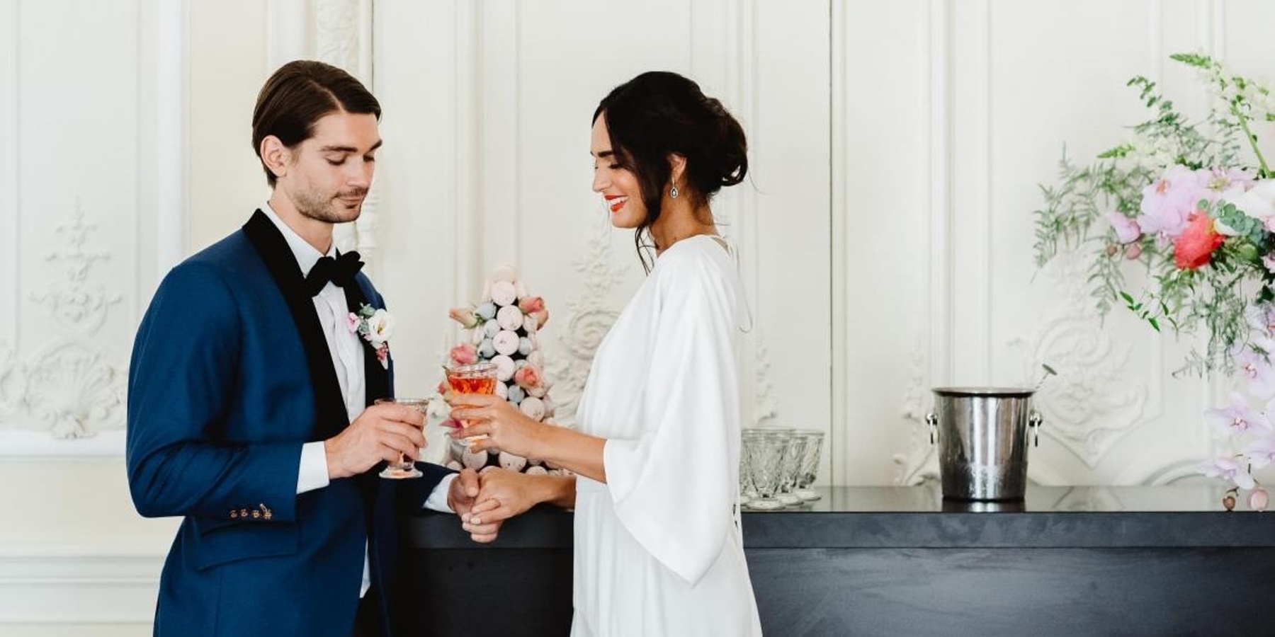
Moody Spring
We are a little biased here, but we love this one the best. This was from a shoot we did at 10-11 Carlton House Terrace where we worked a subtle shade of coral in with stark white, black and shades of pink to create a moody, modern Spring palette.
Grounding the look with a bold black and using touches of neon white meant that all the colours just popped off the table and looked stunning. Coral touches were in the floral arrangements, the cake and in the bridal look.


Check out the #dreamteam who contributed to this amazing styled photoshoot.
- Photography:@fionakellyphoto
- Floral Design:@bloomologieflowers
- Neons:@loveincltd
- Dresses:@charlie_brear
- Planning and Design:@revelryeventsuk
- Cake:@blossomandcrumb
- Suit:@keyelondon
- Shoes:@fabernovella
- Hair and Make up:@makeupinorangeries
- Stationery:@bettylou_design
- Furniture and Tableware:@maison_options
For the full Style Me Pretty feature, click on the link below

